Taking into consideration everything that I had found through my research, I wanted to create a site that showcased myself and my enthusiasm for the subject as well as showing off my work. Because of this I decided to add a brief about me section to the top of the home page. Using a Parallax theme I could add this section and it would not interfere so much with the rest of the site. Using a darkened version of one of my 2D concepts as a background, I feel this shows off my work in a subtle way whilst letting the user know a little more about me and my abilities.
Using the mid section of the homepage to showcase my work, I could include the animations I have made to back up the claims in the About me section. Having these videos embedded in the site allows for easy viewing and quick analysis.
The same applies with my 3D environment model. Having the video embedded just below the character model shows the two distinct creations in their own right whilst allowing them to be viewed as two very different entities.
Below this I decided to use two separate tiles for a link to my gallery. This way the character artwork could be separated from the environment artwork when viewing them. Having this click through to two separate galleries helps distinguish the different type of artwork for potential employers. As the jobs I would be applying for may not necessarily be for both things, having these separate spaces allows for a potential employer to view these things independently.
Below this I have included a short Animation Showreel. Although all the work has been combined in this one space, I think having it this way on the homepage echoes the research I have taken before in showcasing my work early on.
Although I would loved to have replicated the themes from the sites I have analysed, using this theme in the short space of time I had to create the site has restricted me somewhat. In the future, I will progress my site further using these sites as more of a rigid template for my own.
Moving through to the specific gallery page on my site, I have included an easy gallery plug in that allows me to lay out my images in a similar way to those seen in my research. Having the ability to click on and flick through images became a very integral part of my research, because of this I felt it was most important to include this in both the environment and character work I would be plaving on the site.
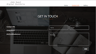
At the bottom of every page I have included a contact form with social media links at the bottom right. This became a staple section of all the portfolio sites I analysed and I believe it should be a very easy and integral part of my own.
Having the contact section to the right hand side and more specific info to the left, it gives the user options as to how to contact me. Seeing a range of different ways in other portfolios, I wanted to make it easy and approachable making steps to contact me.
I opted to use Dreamhost for my site hosting, and in the short time I have used them, they have provided a very slow server for my site to run on. Because of this, I will be moving my site as soon as possible to another host, but for now I have managed to create the entire site and make it like and useable for both my degree and for my movement into the world of work.


No comments:
Post a Comment