Going into the creation of my portfolio site, I knew from my lack of knowledge of CSS and HTML that the best thing for me to do to create my site would be to work in Wordpress. Having struggled through the basics in the first project this year, I think I know enough to be able to go into making my own site.
When looking into my Career Pathways, many of the careers of those I find inspiring in my work helped me to find a niche within the industry that I wish to follow. Because of this, I spent a lot of time looking into peoples personal portfolios in the hope of finding my direction. Through this searching, I have come across some similarities with many of the sites. Analysing each one will allow me to go into the creation of my own site with a solid foundation to work from.
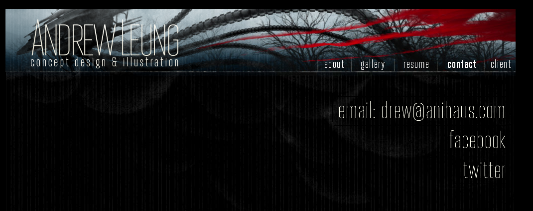
The first site I chose to analyse further is the portfolio of Andrew Leung. Leung is a 2D concept artist and 3D modeller, working on such big names as Iron Man 3, Captain America Winter Soldier and the Avengers. As much of his work inspired me personally, from including him in my Wordpress project as a lead speaker and having his career as something I aspire to to follow, his site is something that really stands out to me.
Right from the get go, we can see two main things with the site; The large header, and the image gallery at the front. Having these two things in the forefront really push the idea that the work is the most important part of a portfolio site and rest can be established later. Having this image gallery places here allows anyone coming to the site to really see what his creations are like before moving on.
Below this, he has a short quote about his work and a live twitter feed. Through looking at his site, it is quite obvious he is not very vocal on twitter, but having this so obviously on the first page gives everybody a chance to find out how to interact with him.
Moving onto his gallery, we can see a similar theme to the front page, in that a majority of the space is taken up with the images. Having a consistent header with his job title and role really reinforces a consistent style throughout.
Moving further down the page, the rest of the gallery is laid out as thumbnails, giving the entire page dedication to the work he has created. I think this is a very important factor when creating my own site and having an individual gallery section is something I feel I would like to include.
The final page is a contact page, laid out very simply with large font. The top most line being his email address, with a link to his facebook and twitter below. Having something this simple does help to get information across quickly and easily.
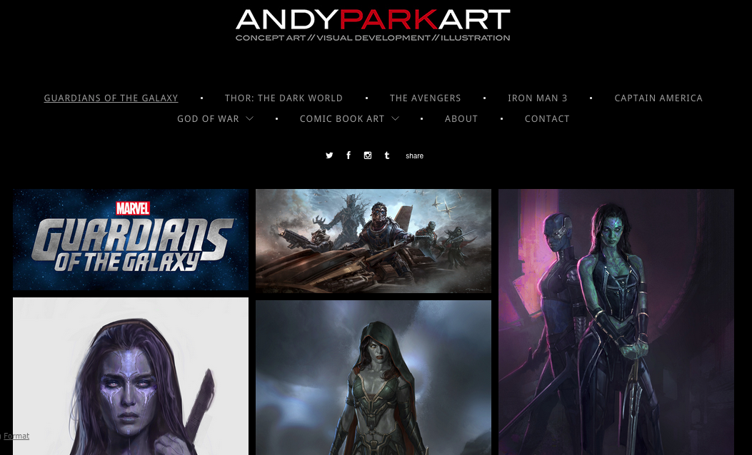
The next artists portfolio I looked into was Andy Park. Park is somebody I have followed throughout my time at university and is someone the initially inspired me to go into concept work and illustration. With his site changing drastically over the time I have been following, it will give me a clearer understanding of what is working and what is not.
Park is a very sought after concept artist, creating work for most of the Marvel movies; including Guardians of the Galaxy, Captain America: Winter Soldier and Thor: The Dark World. With his work being exclusively made up of 2D images, it will give me an interesting look at how this can be laid out.
Initially, the site opens on an image he has created for the upcoming Guardians of the Galaxy sequel with a click through link containing only his name and job title.
Form here we are presented with an image gallery and nothing else. The navigation bar only gives up titles of films he has worked on with small icons to his social media links underneath.
The bottom of the page only houses more links to social media and an email address. Although this site is very minimalistic, obviously it is working. Much like Andrew Leung's site, this portfolio showcases only the work and from that, we can see how successful he has become.
Looking again at another 2D artist, Bob Cheshire. Similarly to Andy Park, he was commissioned by Marvel to create many Environmental Concepts for Guardians of The galaxy.
Looking at the site initially, we see a theme starting to emerge. Having the graphic the main focus of the site is the primary selling point. With a limited number of links at the top leading only to the gallery and contact, it shows again the importance of the work over other small bits of information.
On tis site, the social media links sit statically at the bottom.
As with the other sites, we see yet another thumbnail image gallery showcasing a majority of the work, being able to click through to see enlarged images.
The bottom of every page housed a contact form directly built into the website. Although no web address was included on the site, their remained persistent social media links on each page.
Moving onto another 3D modeller, Sarah Zaher, I noticed even more similarities to the other sites I had analysed previously. On the front page, once again, we can see an image gallery showcasing her work. Although the navigation housed a few more links, the basic layout was very much the same as the portfolios I had been looking at before.
With the front page just housing this image gallery, it again becomes clear that the work is the driving force behind the site as a whole. Having clear images and direction for the site makes it easy and fluid to use.
This site in contrast to the others I have looked as has an About section. Although this hasn't been present before, Zaher is not an artist that is too well known. As in my case I will be beginning my job hunting after I graduate, I will not have any prior experience. To me, having this About section on my portfolio site seems like a good idea. As with Zaher's site, she has laid out her experience with 3D software, her skillset and her resume, I think having a short biography about me would help to put across a professional attitude.
As with many of the other sites i've looked at, there is a short form in the contact section of the site. I think if I could perhaps find a plugin that would help me with this in Wordpress, it would make a very neat addition to the site.
With other 3D artists the portfolio's followed a similar theme. In the case of Johan Steen, the focus of the homepage was again a gallery. Showcasing Steen's 3D artwork in a 2D form in the way of a gallery makes the whole site very practical and easy to work with. Having the same theme as many of the others, with a bold header and strong navigational structure, I think this is something that will be very important when developing my own portfolio.
Again, the contact section of the site seemed to be a built in form. Having this as a main feature of many of the sites i've looked at really shows it's importance. Alongside this, having all the social media links in this section has proven to be very important.

Graeme Borland is a designer I have been following since before starting my Degree. Initially finding him through tumblr I have followed his progress up till this point. His social media presence is massive and it really shows with his body of work. Not only does Borland have his own portfolio of work, but he also keeps an up to date blog showcasing a Sketch of the Day. This blog consists of 2D conceptual artwork that he does over a 20 minute to half an hour period and posts his results at the end of the day. The Tumblr site is very basic, but the idea behind it is flawless. Connecting this Sketch of the Day blog with his portfolio site not only shows his commitment to the field, but his every growing desire to improve his craft.
In practise, this is something I would very much like to adopt myself. Working for half an hour a day to create a concept is something that I think will help me greatly as I move forward in this field.
Looking at Borland's site, we can see a distinct difference between this and the others I have looked at. The site itself is very basic, connecting to many external sections and more elaborate and in depth segments on the site. As Borland professes to try his hand at anything within the field, much of the site is separated out into projects rather than types of work.
Having the site laid out in this way makes it very easy to look at and navigate. Showcasing many different types of creation gives the portfolio a very unique feel to it and creates a very interesting perception of the artist himself.
Although the site looks vastly different from the others I have analysed in many ways, the key sticking feature is again, the contact form. Because of it's consistent appearance throughout all of the sites I have looked at, I feel this is one of the most important features to include. That, along with a working image gallery and links to social media, I think this will allow me to create a working, professional looking site.